The Jazz Fest poster has been worse. 2004’s Harry Connick, Jr. poster holds that dishonor for being banal and presenting a Connick that looks more like Warren Beatty. But let’s look at this year’s poster:
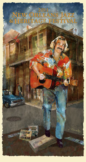
Art4Now, who does the Jazz Fest posters, went to local broadcaster Garland Robinette for the image, which raises the first question: Why? In a city full of artists, why go to an amateur? In this poster, Robinette’s shortcomings show in basic ways. Both of young Jimmy Buffett’s knees are bent; what’s carrying his weight? And his right leg is bent as if he’s standing on the bundle of newspapers, but with his head and shoulders shifted toward this left leg, the right leg isn’t carrying any weight. Instead, it looks as if he’s holding it up to avoid stepping down on the bundle. The papers show no signs of distress from his weight; in fact, the shadow under the front right corner of the bundle suggests that it’s not resting on the ground, even with his foot on it. Which raises a second question: Why isn’t that bundle resting on the ground?
That shadow and the shadow of the building behind him suggest that the light is coming from the left, but it’s not clear how high it is in the sky. The building suggests the sun’s low, the car in the background suggests its noon-ish, and I’m not sure that the “Will Play for Gumbo” bundle and the bundle it’s resting on are casting shadows at all.
I could further dissect Buffett’s shirt, where Robinette has opted not to deal with the way it hangs, folds and shadows when worn by someone hunched over his guitar, instead letting the floral print obscure those details. But the point is made. At a technical level, the image has some issues, and they wouldn’t matter as much if the overall look Robinette was going for was less representational. But the well-executed building behind Buffett and the street scene depicted show Robinette trying to make the scene look more-or-less like it looks, albeit with a slight blur that I take to be his hand as an artist. In that context, the breaks from the overall style of the piece need to be meaningful to be seen as anything other than technical shortcomings.
The problem with this year’s poster isn’t Robinette’s work, though; it’s Art4Now’s decision to do it in the first place. It’s hard to get around what a cynical choice this is, seemingly made from the simple equation that people like Jimmy Buffett, people like New Orleans and, evidently, people like hair. Combine them and that’s good enough, as long as it’s all recognizable. The poster is reduced to a Big Mac, made no better than it has to be because as mediocre as it is, people buy it.
Discussions of the Jazz Fest poster inevitably bring to mind the work of Komar and Melamid, Russian-born, American graphic artists who have made a project of doing art by polls, asking people specific questions about their preferences in art, then making pieces that catered to those preferences (or, in the case of their “Least Wanted” series, pieces that incorporated the things people liked least.
The original of this, their “America’s Most Wanted” piece, was the size of a dishwasher, determined to be the most popular size of art in America. Other findings: 44 percent of Americans polled prefer art that’s blue; 64 percent prefer traditional art (as opposed to modern art); 88 percent prefer outdoor art; and 60 percent agreed with the statement, “I prefer paintings that are realistic looking; the more they resemble a photograph, the better.”
I didn’t realized until I put Komar and Melamid’s painting in this post that Robinette’s sky is similar to theirs, and they share a slightly romantic soft focus; I brought them up because their painting is a straight-faced comment on art preferences, following them to create a piece that is as lovely as it is absurd, with deer frolicking on the water and George Washington standing alone looking presidential as vacationers walk toward the water. Art4Now’s posters often give us the illogical image without the tongue-in-cheek. For example:
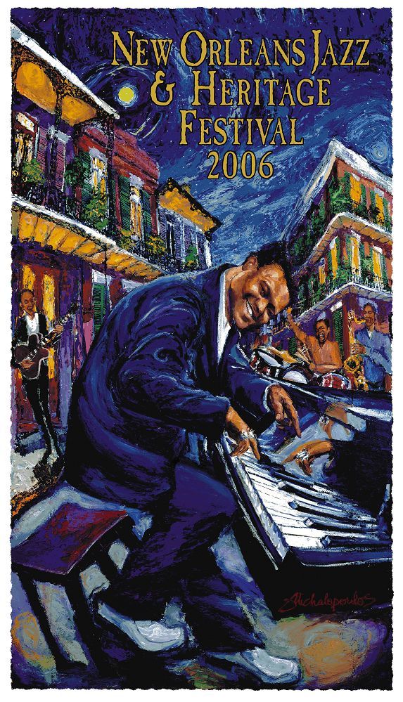
Why is Fats Domino playing in the street? (Because people like French Quarter scenes?) And where is that guitar on the left plugged in?
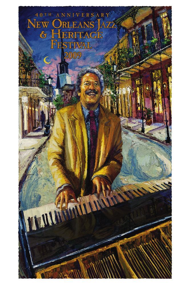
Why is Allen Toussaint playing in the street? (Because Fats did it and lived? And who’s moving all these pianos into the street?)
These make me wonder if Art4Now has its own form of market research. Clearly, the featured artist needs to be centered and in action. To their credit, these posters take a slight chance by featuring an artist—James Michalopoulos—whose work is stylized and not strictly representational. But he and two-time poster artist George Rodrigue have established reputations as artists; perhaps Art4Now’s surveys show that people will tolerate stylized elements such as warped architecture if the artist’s name recognition and perceived market value is sufficient.
In the end, this year’s Jazz Fest poster is like so many Jazz Fest posters; it represents the depressing decision to aim low. Each year, it acknowledges people’s love of New Orleans and the festival, then sells them the equivalent of a Bourbon Street T-shirt.

